Miscellaneous Notes by Jostein Kirkerud
“I paint, therefore I am…”
“Aesthetics is to the artist what ornithology is to birds”, is a quote by Barnet Newman which has lingered at the back of my mind for many years. It has given me the freedom to act creatively, without constructing some idea of aesthetics or other artistic anchoring than my own existence, and the histories that coincide with this. Intellectually, I am a boring person, roaming through the worlds of literature and art, hoping that the paintings I make might lead to meaningful experiences for whoever sees them – on any level and in any way. What matters is making paintings I’d like to see myself – and which no-one else can make. Anything else is essentially a question of marketing, commercially and intellectually. I don’t need any Foucault, Virilio, Derrida, or other “singing-masters of my soul”[1], to make paintings or give them context. Which doesn’t mean I’m not familiar with them, I just don’t put much stock in a philosophy of aesthetics. Of course, if my subconscious has taken in some of it, I wouldn’t know. But I’ve never had a theoretical foundation for what I do.
[1] “Sailing to Byzantium” by W. B. Yeats

On the White-Out Series
The term white-out refers to a meteorological phenomenon where poor light conditions, snow, and fog combine to deprive you of sight and blur out contrasts, making you lose all sense of space, place, and direction. It is not unlike flat light, which is a known thing. In Norwegian, white-out is called “snow-darkness”. The first pictures in this series came spontaneously. I’ve always been fascinated by white as a colour. And not only as colour, but as texture, and how it captures the light, is different on reflective or matted materials, and absorbs colours from the surroundings. Its ability to be sealed and impenetrable, transparent and secretive.
My first encounter with white’s allure occurred when seeing the white paintings by Turner. They transfixed me on my first trip to London many years ago, in the late 70s, in the old Tate. The shimmering, white light which both covered and revealed the elements of the paintings felt like a glimpse into eternity. Since then, the works of Robert Ryman, Cy Twombly, Mark Tobey, Raimund Girke and others, have served as inspiration through their different use of white. Also interesting is the “colour-atlas” of Robert Meier, architect and artist, which is called Thirty Colours, and contains only shades and samples of white. Just goes to show what range the white space has.
The use of white as a colour started for me with painting over and reapplying base to “rejected” pictures. To see the underlying layers through a transparency in the areas which weren’t completely covered gave me an experience of space and distance which was interesting. And off I went. The first series consisted of small canvases where I juxtaposed drawn and carved lines against the white (2001). Later came pictures were pastose and transparent sections were played against one another, where light and shadow was created in the pastose sections and underlying shades shone through the transparent sections (2010). This changed through the years, and later drawing and collage came to be core elements in a more black-and-white mode.


On visual art and graphic design
In my work as a visual artist and graphic designer, the big common denominator is composition, or visual organisation. To organise an expression, a message, shape the communication. As a graphic designer you have to specify what it is you’re trying to communicate; as a visual artist it’s a bit different. As a graphic designer, the visual whole must be shaped in relation to image and text: the choice of type and size for the letters, the layout, and the kind of images used. You have to make decisions to coordinate typography: the headings, the standfirst, and the body, find the size and proportions of the setting surface in relation to margins and columns, as well as the right typeface. The aim is to create a typographic display of contrast, movement, balance, and composition.
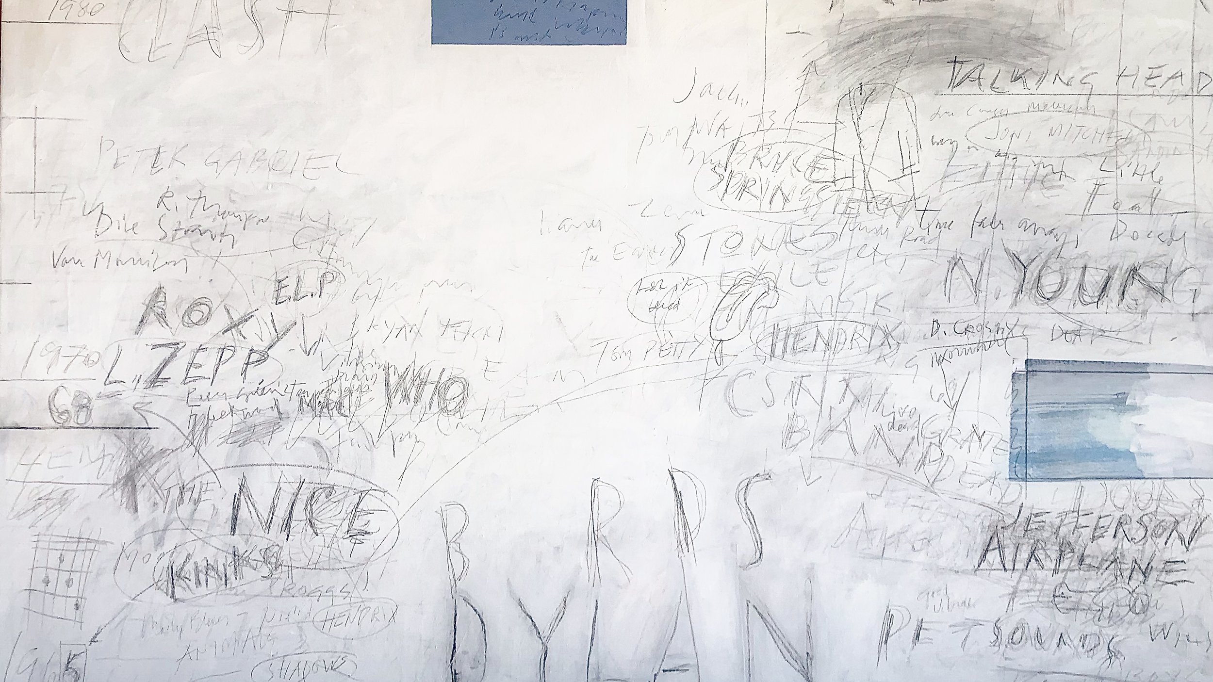
When it comes to the handwritten text and calligraphy, this is something I have played around with since college. Formskrift[1] in primary school, and later attempts at stilskrift[2] with stortingspenn[3]. The letter-images of Paul Klee also made an impression. Letting writing into the images has therefore, for me, not only roots in American art from the 50s and 60s (Rauschenberg, Jim Dine, Jasper Johns, etc.), but is linked to my own journey. If you look at my practice, you’ll see I’ve dabbled with a lot of styles, and have not been too faithful to any specific form. At times this has been a source of frustration, but it’s more fun to be Espen Askeladd and say “I found, I found” than to be Per or Pål[4].
[1] Cursive handwriting where the letters are only partially linked.
[2] Cursive handwriting with linked letters.
[3] Old-fashioned name for a pen nip.
[4] Characters appearing in several tales collected in Asbjørnsen and Moe’s Norwegian Folktales.
The quote refers to the tale "The Princess who always had to have the Last Word ", in which Askeladden picks up the things he finds along the road.

Process, technical
In most of the paintings white foundation is the base. Drawings and collages are built on this in several layers. Painting over is an essential part of the process. I normally use the colour Titan White, which by itself has good coverage. I use both water and modelling paste to dilute the colour and make it transparent. Mixing white is already transparent on its own and works well too. When I get to these layers, I normally use a roll instead of a brush; it creates less mechanical wear on the drawing, so the graphite of the pencil doesn’t bleed. When I’ve used coal, I have to add a protective layer of varnish or the like to keep the drawing intact. I often add more pastose layers, which I scratch into.

Process, picture
What plays into how and what a painting becomes is a rather unruly process. How the idea of a given painting develops is not very clear to me. It may start with a clear idea, a line of text, a slogan, or a theme, after which the process of finding elements which will make up the picture is more a journey of discovery than a set strategy leading to a specific goal. There is often a thematic context which dominates as a core. Deciding when a painting is finished depends on a sense of formal completeness in relation to the overall theme. Given that painting over is a big part of the process, there’s always room for change. Themes may change, and paintings are revaluated after a certain time. What’s most important to me is finding visual material and placing it in the painting, as the visual aspect is always my main interest in making a painting; I have little to say, but much to show.

About the artist
Jostein Kirkerud (b. 1952 in Narvik, Norway) is an artist and painter based in Larvik, Norway. After starting his career as a graphic designer, he went on to graduate at Tronheim Academy of Fine Art (1976-1981) and was later associate professor at the Faculty of Architecture and Design at NTNU (1988-2017). He’s had a number of solo and group exhibitions – in Oslo, Tronheim, and Berlin – and is represented in a series of public and private collections and commissions, belonging to institutions such as the Norwegian Arts Council, Trondheim kunstmuseum, St. Olav’s Hospital, Fokus Bank, and others.
Images (from the top)
Artworks:
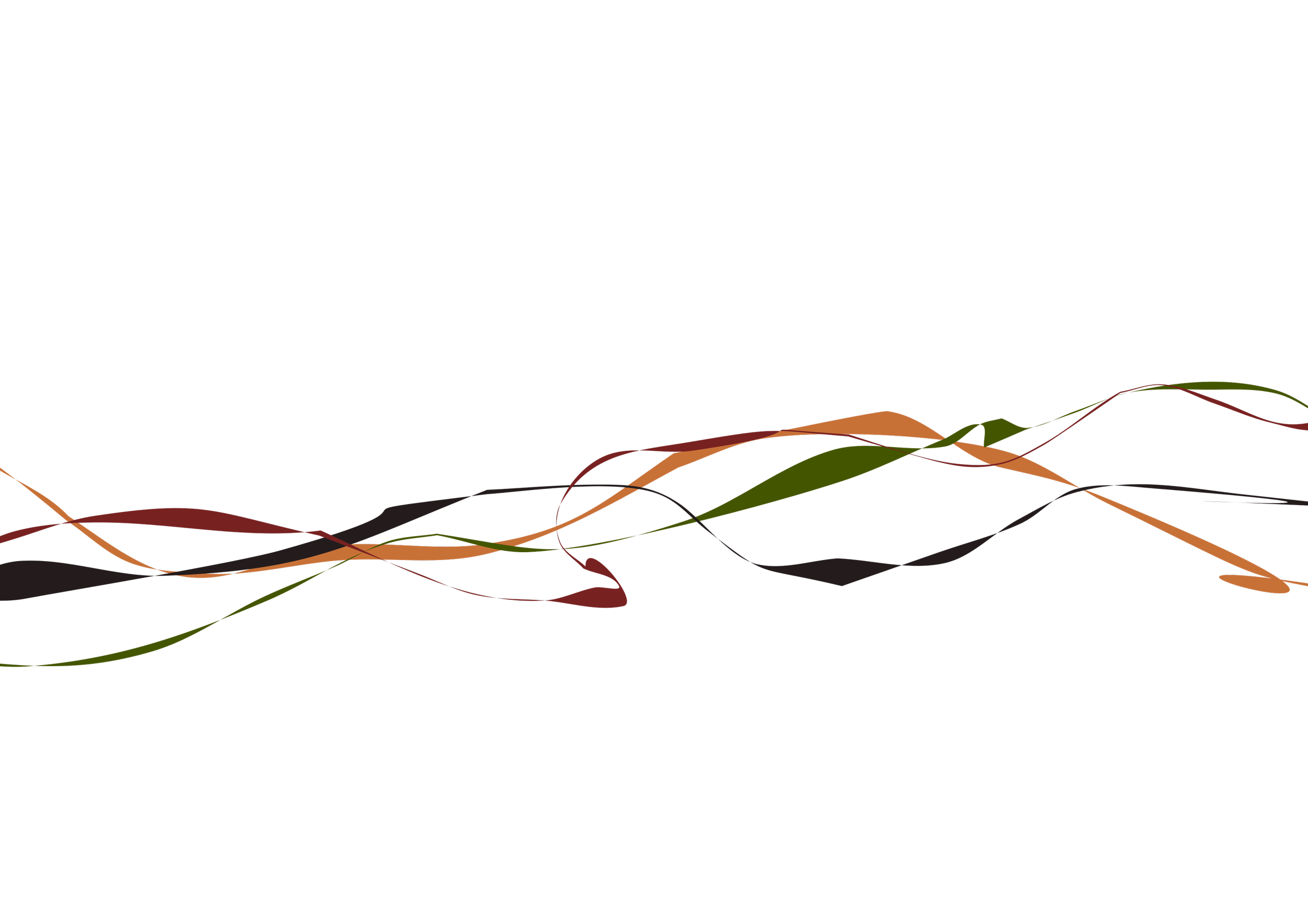
Playlist 65-80, 2021
White-out VII, 2017
White-out IX, 2017
Rhodopis, 2017-19
Hytte, 2022
Photographs:
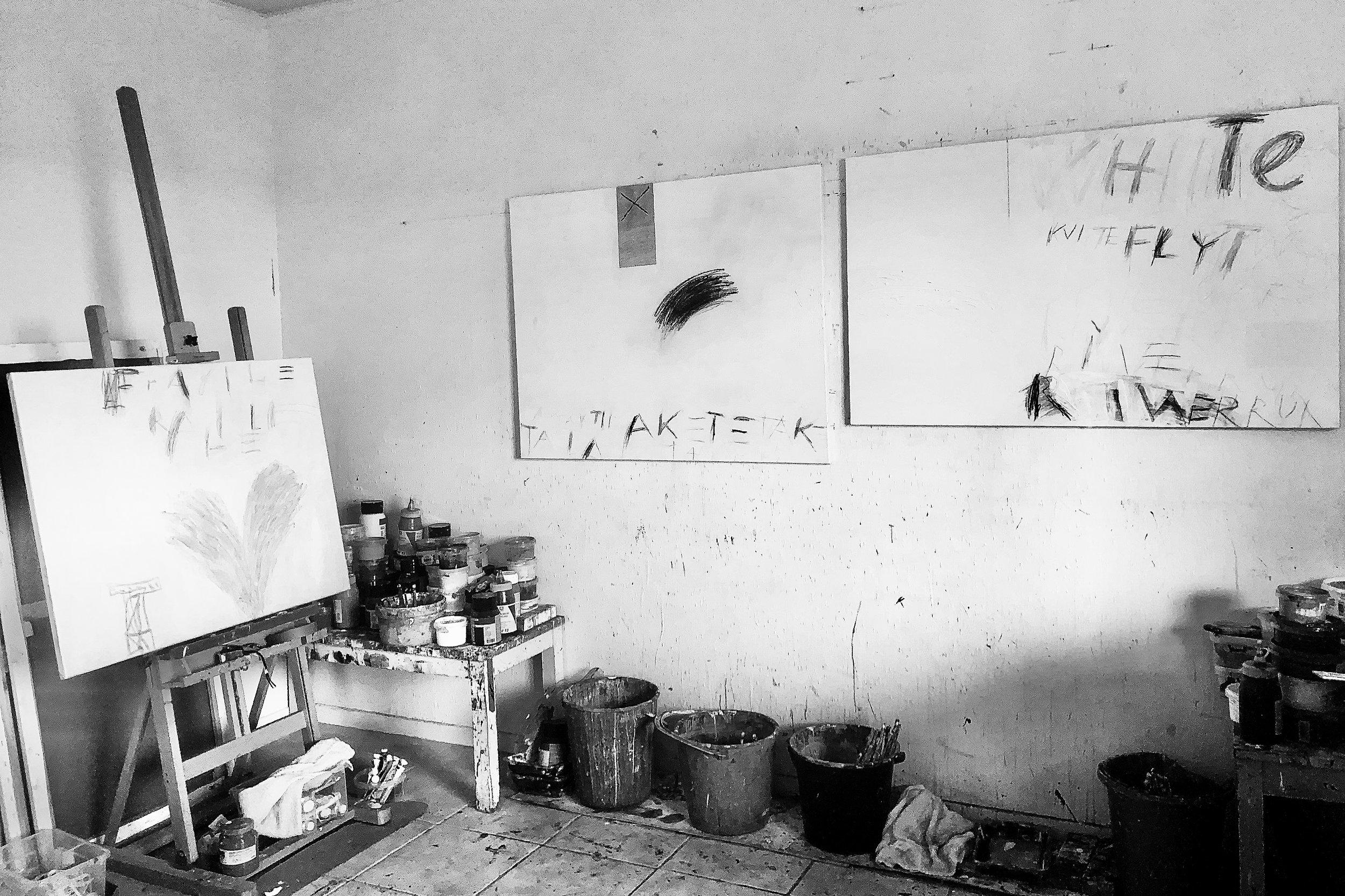
Kirkerud’s studio, Larvik 2022
Robert Ryman catalogue, Whitechapel Art Gallery 1977
Richard Leeman: CY Twombly, Schirmel/Mosel 2005
Ludovico Vicentino, Tidens Förlag 1958