The Practice
of Lina Nordenström
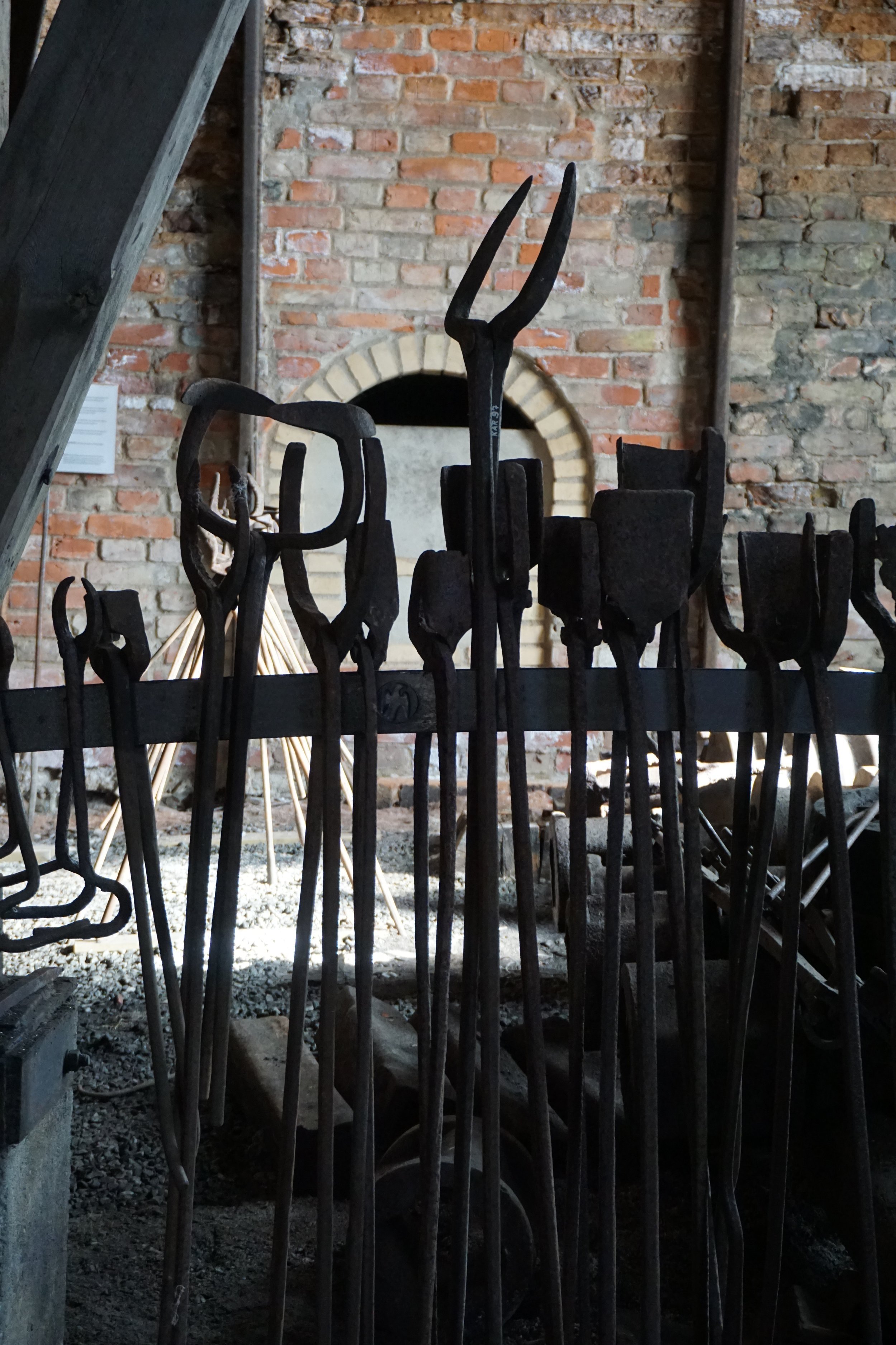


In 2021 I visited Karmansbo Smedja in Västmanland. It’s an old Lancashire smithy and was in use well into the 50s. I’d been there many times before, but this time, for the first time, I approached the smithy with a project in mind. It would be a long and winding journey to the culmination of the project in the summer of 2022, but along the way I gradually understood why this specific setting struck me so the first time I visited it.

In August 2022 I moved into the smithy with my large character prints: compositions of the letters “i”, “r”, “o” and “M” – all taken from the name of the author Moa Martinson. The prints stemmed from a commission ten years previous, when I’d been asked decorate Moa Martinson’s square in Stockholm, and I decided to cast the author’s name in enlarged lead type.


Back in 2012, placing the sculptures in the square had felt a bit like an ant placing a text on a giant printing bed. It was like a daydream come to life. Placing lead type by hand had brought given me a different perspective – the three-dimensionality and physical tangibility of the letters had made them appear in a new way, as form. As sculptures.
Working with hand setting, with lead and wood type, has been a defining part of my work. It has fundamentally changed my relationship to text and to writing. This is in part down to the weight and shape of the type, but also the slow process of piecing together each word and sentence, with all their distancing and empty spaces in the form of so-called furniture, making the experience incredibly concrete. The weight of a lead kit cannot be ignored. It invites a new approach, where the printed word becomes tangible as an object – and thus as a “subject”, if you will. It has made me aware of how strongly different technologies influence my way of expressing myself. Every linguistic expression is a result of its own conditions – including its material.


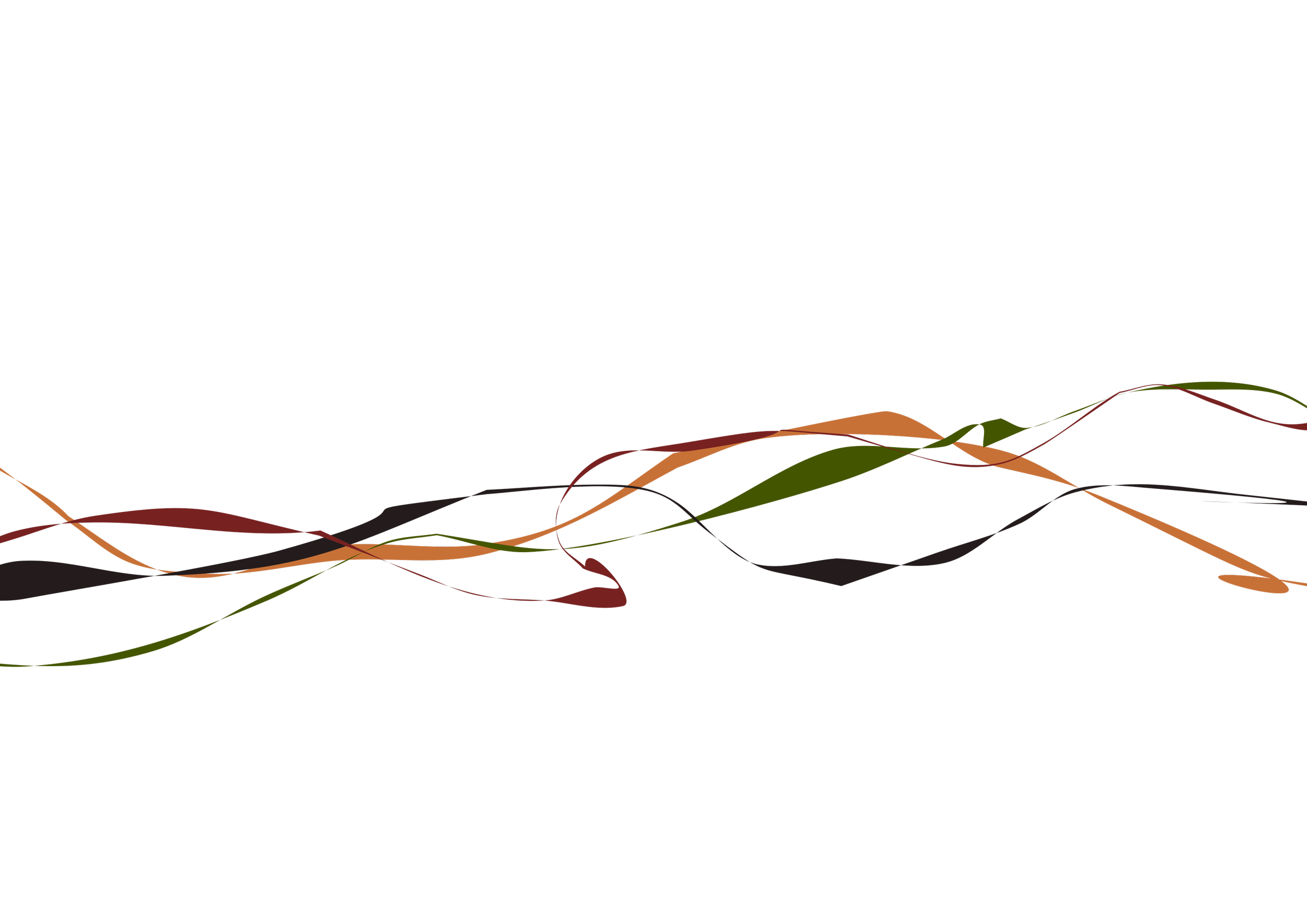
As the letter sculptures in Moa Martinson’s square gave me the opportunity to work with a new visual language thanks to the large scale, I noticed the strong resemblance between the shapes of the type and the shapes of the printing press itself. I suddenly noticed the striking similarity between the letters and the old Krause presses. Was it a coincidence? The letter as a machine, as a tool? Placing the prints in the studio workshop gave the impression the work was deliberately site-specific. I was amazed when I discovered this.
However, another part of my practice is the typewriter; always trying to investigate how technology affects my way of expressing myself in text. The most obvious consequence is how well the typewriter lends itself to repetitions and regular geometric patterns, which is not as obvious when working with letterpresses, not least because there are a limited number available of each letter. Also because different letters have different widths, because of the design of the letterpress typefaces, which of course provides completely different conditions visually, compared to the typewriter.


The series “tre små ord” is available in many different versions, also translated into English – three small words. The act of repeating the words on the typewriter, of writing them out as patterns, made me interested in the sounds of the machine: the rhythmic tune the machine generates as the letters are repeatedly stamped against the paper. It became a reminder that our alphabet is based on the idea of each letter represents a sound. A text is essentially a notation, even if we have learned to read silently.

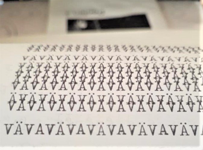

The letter O beckons an examination of the illusion of a circular chain of motion, its association with the mechanic gears, even the printing press itself as a construction. In it I discovered a new, inspiring, and striking connection between the letter, the image, and the machine. The letter C, repeated here in a circular pattern, offers yet another kind of revelation in repetition.


Through this I find my way back to the art project in Karmansbo Smedja. In its day, the smithy ran entirely on waterpower, with mumbling hammers and gears driving large bellows to get the coal-fired furnaces up to the required temperature. It produced iron and steel, the same materials as the gears and rods in the letterpress are cast from. It evokes the same shaping and casting which creates each letter in a type case.


The project in the smithy inspired the project “The Poetics of Mechanics”, a collaboration with musician and composer Sten Sandell. We challenged ourselves to base it on the location, and to find a way to conceptualise our experience of being there.
The recorded sound from the smithy’s machinery and from the waterfall formed the foundation for Sten’s voice and sound improvisations. We alternated between making sound poetry inspired by the rhythms of the machines and reading a frame narrative of sorts. We then added elements of typewriter performance and rhythmic performance on a press (a so-called table platen) as I printed a cliché of a typewriter in front of a live audience.

Against the wall in the picture below is projected a handwriting, a diary entry written by an unknown resident of 1917 Karmandsbo, nicknamed “grandfather”. We included it in the performance, not only as a testament to a person who lived and worked in the area at a time when the smithy was in use, but as an example of another technology – the hand's own expression through handwriting.

The work with the project in Karmansbo Smedja gave me a deep insight into the extent to which my practice is rooted in working with graphic techniques. The choice of material and technique generating different artistic processes may seem obvious, but what I return to in my search is to give the technique itself its own voice, alongside the work. The smithy – with all its connections to the letterpress workshop – was immediately inspiring.
Expression through writing has always been a proclivity for me. The written word is close to the heart, yet the strength of visual art lies in the fact that it’s a physical form of expression, making it part of our surrounding reality. Putting the prerequisites of the technology, the production process itself, in focus, is a way to enhance the physical appearance to the maximum. The aesthetic language grows out of the technology – at the same time as the language takes physical form. That's why I find working with letterpress and typewriting so fascinating. This way, the text, the word, and the letter are made physical, and visual expression and content become one: concrete poetry.

About the artist
Lina Nordenström (b. 1963 in Stockholm, Sweden) is a visual artist, primarily working with prints, drawings and artists’ books. She studied at Gothenburg University 1982-85, The College of Printmaking Arts in Stockholm 1991-95 and the Royal University College of Fine Arts in Stockholm 2000-2002. Since 1995 she has been exhibiting regularly in Sweden and internationally, including various artists’ book fairs.
She has been teaching on a regular basis at The University College of Arts, Crafts and Design (2007-2018) and The College of Printmaking Arts in Stockholm, where she was head of the letterpress area 2007-2010. Since 2009 she is running the print studio Grafikverkstan Godsmagasinet in Uttersberg, Sweden, together with her husband and colleage Lars Nyberg.