A process
by Tydningen
In our editorial work we often return to the necessity of finding a form. For us, working editorially with the literary magazine is in its essence an artistic practice. We have found that the magazine allows us to create spaces for exploratory and experimental ways of making art.
For many years, our magazine was anthology-based. This structure, which the literary magazine often relies on, allows one to assemble and arrange heterogeneous materials in a preset graphical and thematic framework. While the standardised anthology magazine is useful, it makes it difficult to create something new and previously unknown.
We grew tired of this form, which seemed weary and predictable, primarily when working with poetry. We wanted to think, as poet Claude Royet-Journoud has said, of the poetry magazine as an object whose movements must carry a sort of fervour, to operate on the brink of implosion. We found that to work freely, one needs to continuously search for different forms that set certain limits and create new spaces which, to some extent, think and act for themselves.
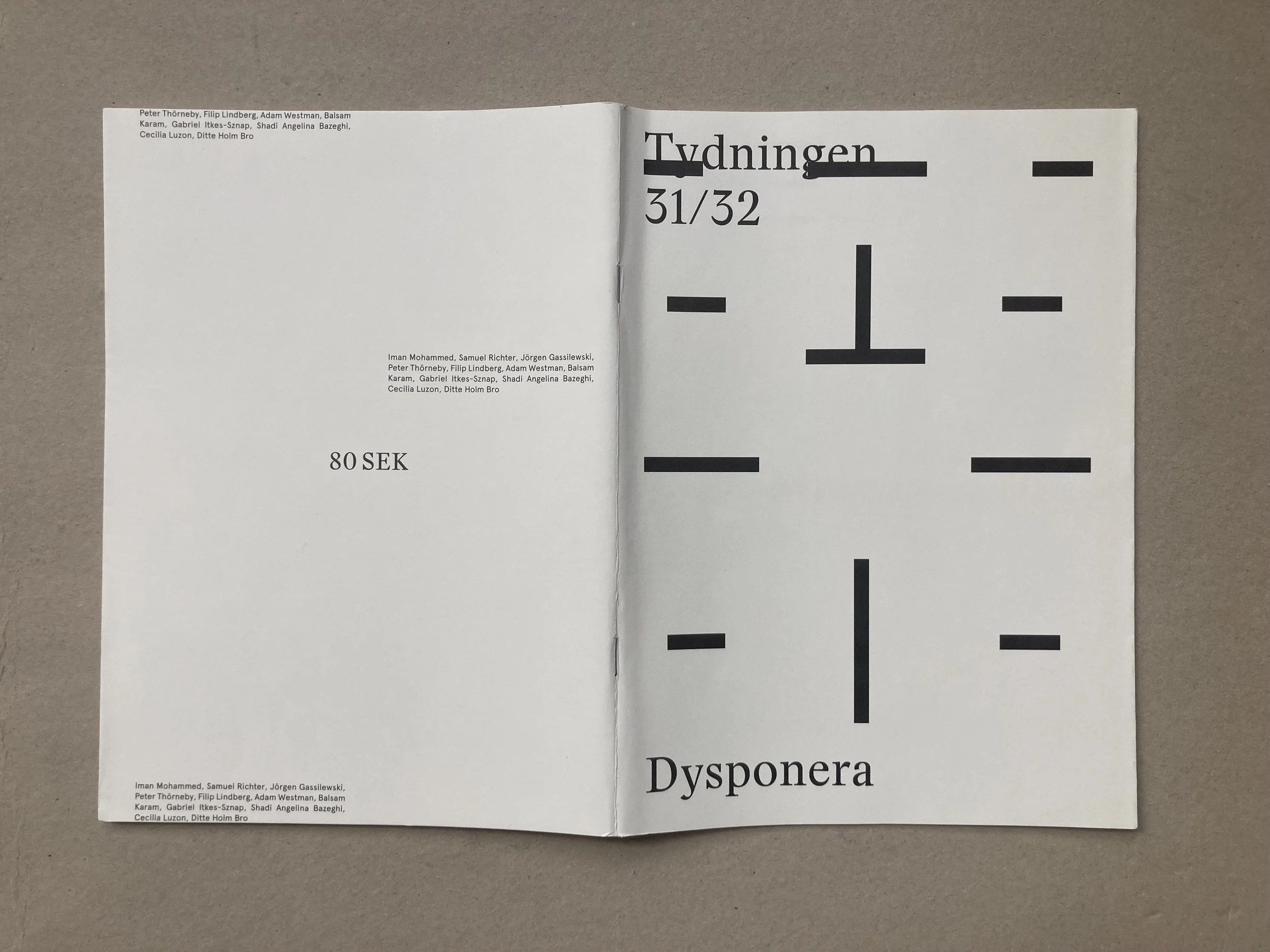
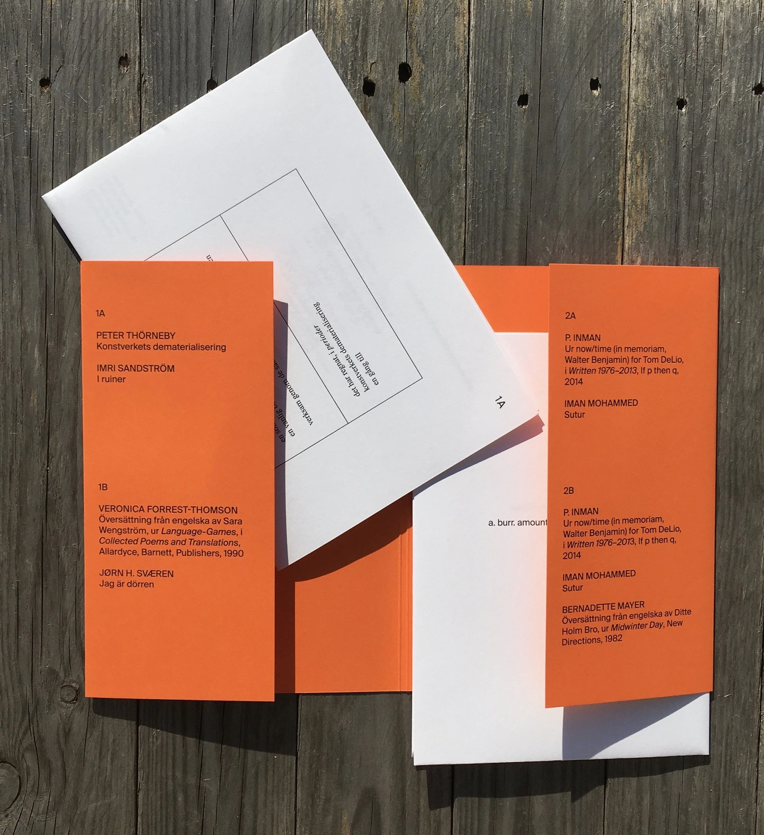
Working with Tydningen no. 31/32: Dysponera (Disorganize) we collaborated with poet Adam Westman in exploring montage as an editorial practice. Using montage as an artistic technique allows one to break the linear and spatial disposition of the magazine and deconstruct habitual reading patterns.
As editors, we set out to cut up materials to reduce order: to give rise to different shifts, collisions, distances and relations between the poems and images. In short, we wanted to make use of montage as an act of writing. But since we hadn’t done this before, we had to invent principles as the work progressed. Here, questions from the invited writers guided us.
What’s the smallest divisible unit in the montage? A page.
Will a title or the author’s name be written on the same page as the poem? No.
Will there be a standardized font? No.
DYSPONERA
The discussion continued between us and our graphic designers, Fält, who we’ve worked with since this issue:
Will the pages be numbered? Yes, but placed as discreetly as possible, hidden close to the spine.
What kind of paper will be used? A thin natural paper, to let the forthcoming and the previous pages be visible under the current one.
We then contacted the contributors with our own questions and drafts. The contributors’ different and sometimes contradictory wishes and demands formed the process. The multitude of texts, practices and perspectives generated friction which charged the issue with an immense tension. In this tension, we discovered montage as the art of arranging differences; a method which aims to assemble without levelling or neutralizing.
LEPORELLO
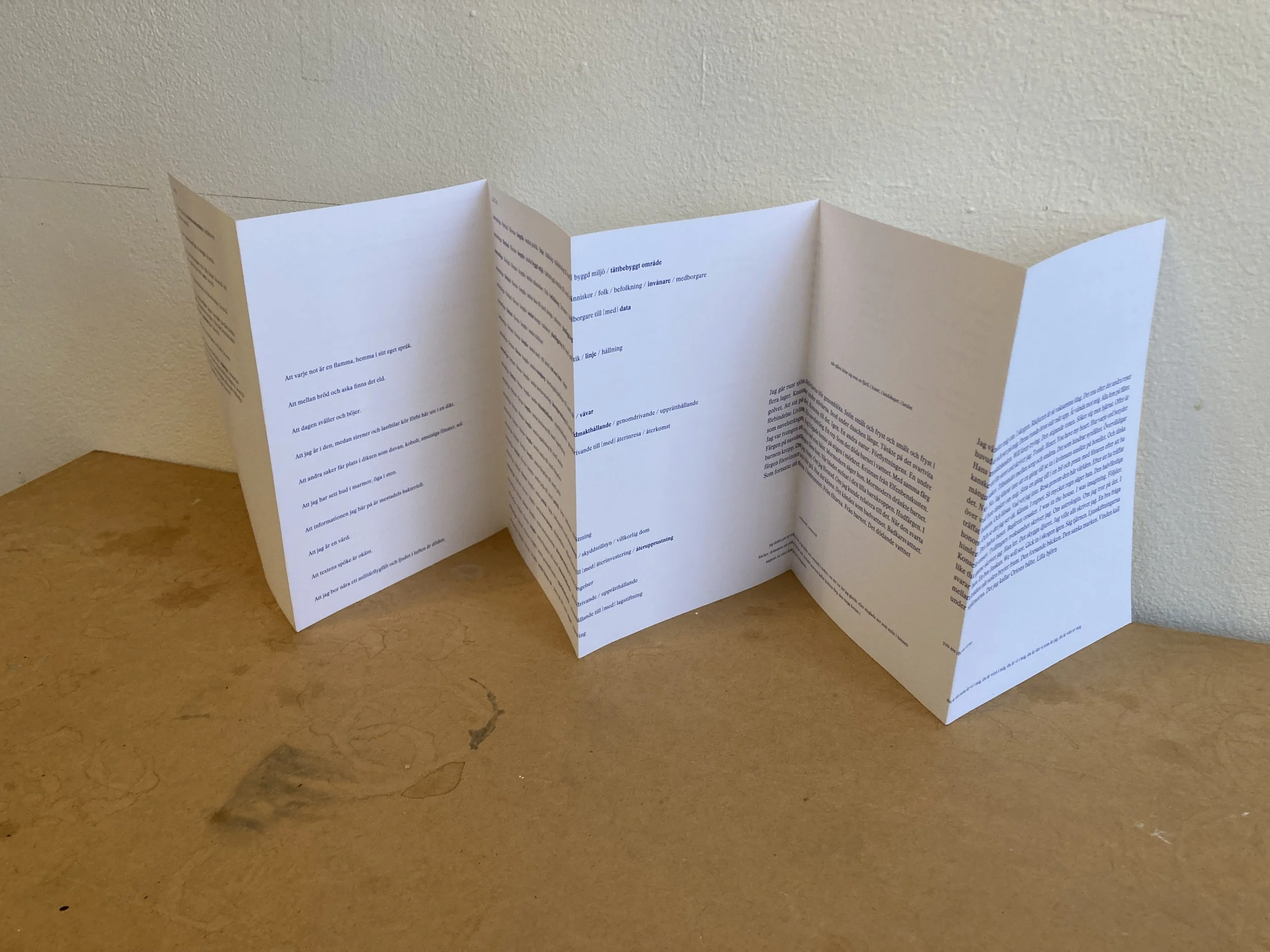
Instead of naming the issues after a method – as Dysponera – the issues since were named after their physical formats or contents. We wanted to further investigate the material conditions of the magazine and the book, and after a period of research into different alternative forms of publications, issue no. 36: Leporello took the form of a leporello, also known as an accordion, or z-fold.
A bit like a möbius strip, the leporello issue does not have a defined in- or outside. Instead, one may look upon it as if it forms one continuous looping page. There is no cover, no spine and no binding. The unfolding and collapsable book object replaces the binary topology of the page spread with horizontal sequences. The sequencing in turn stipulates its own temporality, different from the one of an “ordinary” book. This form further invites the reader to manipulate the object, to try different ways of folding and reading, thus mapping out their own paths.
We started the process by planning a publication with 48 panels, but 12 was enough to make the compositional work both complex and complicated. With scissors and tape, we spent a long time trying out different placings and formats on crude paper dummies. While printing the featured texts to test various compositions, the black printer ink ran out, forcing us to use a blue colour instead – which we kept for the final publication.
One of the poems, a translation of Peter Gizzi’s “That I Saw The Light on Nonotuck Avenue”, starts on one panel, going from top to bottom and then continues in the same fashion on the opposite side. The panel becomes a microcosm, almost a möbius strip of its own, twisting around the recto and verso of this particular page, while still being a part of the overall composition.
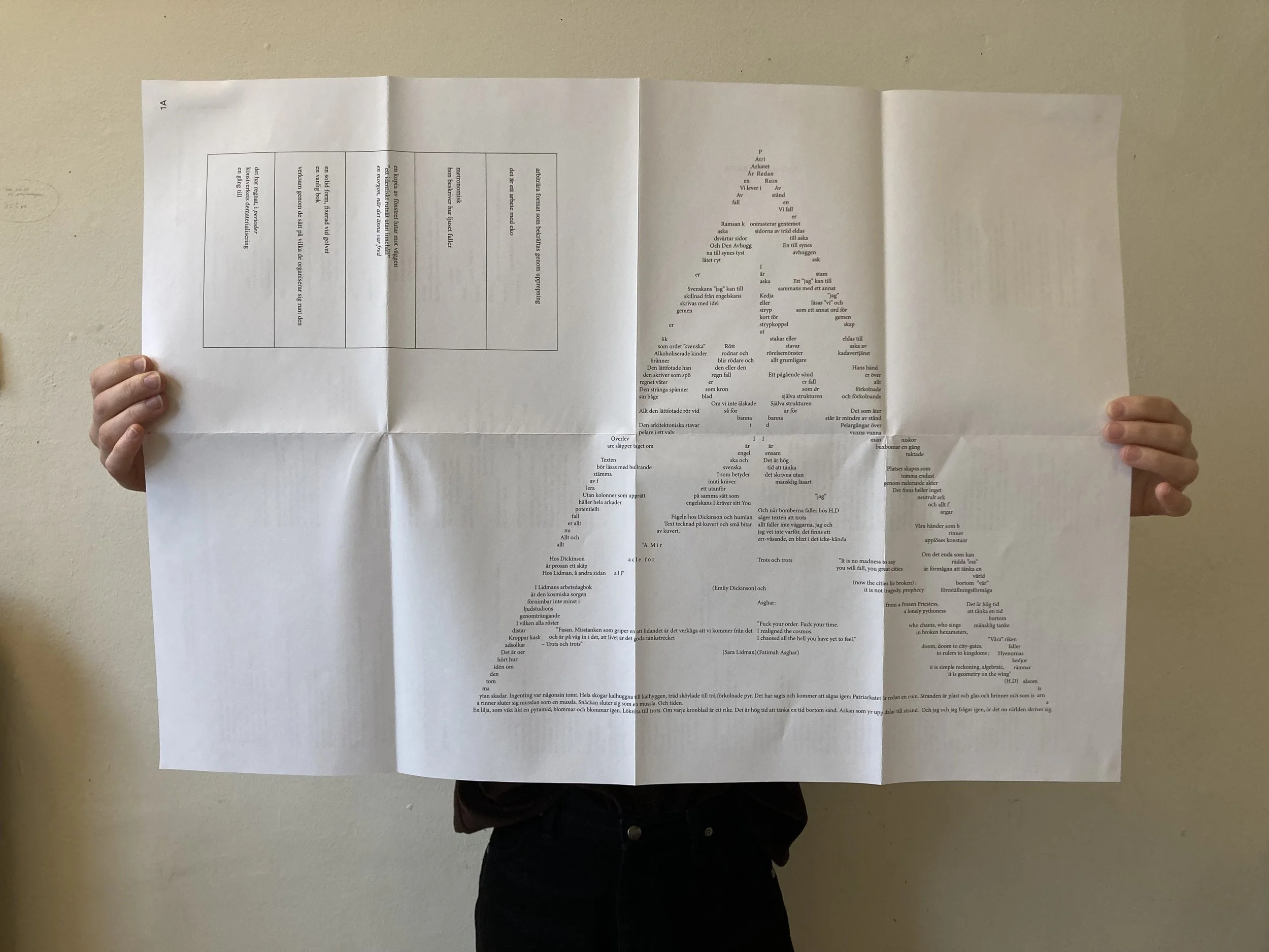
In contrast to the horizontality of the leporello, Tydningen no. 40: Ark (Print Sheet) consists of two foldable print sheets, placed in a dust jacket. We got the idea of this format when we received an uncut proof of a previous issue from the printers; as we began the act of unfolding and folding, twisting and turning, we realized the potential for a future issue.
By starting from the uncut print sheet, its spatialities unfold. Which is to say, the spatial units of a conventional book object are unfolded. Depending on how you read or view the issue, it consists of 2 print sheets, 4 sides, or 32 pages.
Treating this wide surface as a format reminded us of the unfolding of a map. But in this case the folds themselves represented spaces or units – and we invited poets to write for specific places within this architecture.
Our invitation to one of the poets read:
You’re given a space equivalent to a maximum of four pages (1p ≈ 170 mm × 240 mm, standing). You are free to decide how to dispose of these “pages”, i.e. if you for example want to let your contribution run horizontally or vertically, arranged as a unit or placed separately. You don’t need to take the folds into account, unless you want to.
In the end, it is quite clear that the poets used their designated spaces differently. Often the folds appear as a concrete spatial aspect of the room that the poems inhabit: as walls, corners and thresholds.
ARK
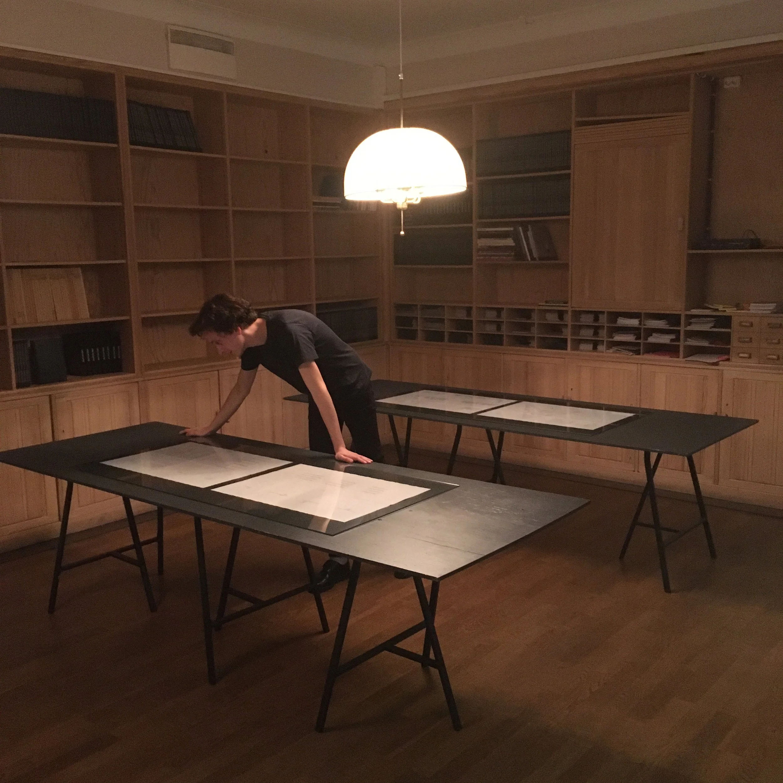
In October 2021, we organized an evening of readings at Marabouparken konsthall in Stockholm, celebrating the release of no. 40: Ark. In connection to the programme, we also exhibited the publication in the gallery’s library – an installation that was open for public viewing for five days following the release. We exhibited the unfolded print sheets in vitrine tables – displaying each of the publication’s four sides. The tables were placed so that one could move freely around them, viewing the publication from various angles and perspectives: reading upside down, going back and forth, coming close or taking a step back. To present the publication in this way not only challenged the differentiation between artwork and book, but also emphasized its spatial and temporal logic. The exhibited book object further extended the issue’s exploration of the spatial units of the book, and the uncovering of ways and directions of reading.

MONOSTICH
While working on Tydningen no. 43/44: LITTLE SPARTA – which explored Ian Hamilton Finlay’s conceptual poetry and sculpture garden Little Sparta in Dunsyre, Scotland – we came across the monostich as a form. We were interested in the way a single line could embody the dimensions of a poem and wanted to investigate what a collection of monostiches would entail. This resulted in Tydningen no. 51/52: Monostich. An issue containing 74 monostiches, 74 poems consisting of a single line, written by 74 authors. In this structure, the lines are both singular and part of a greater line which runs throughout the issue.
We decided that to explore the form of this collection there needed to be a set of rules for every poet, and these were: 1) the line cannot be broken, 2) the maximum number of characters for the poem is 95, including spaces, 3) the poem cannot have a title.
After all the monostiches were sent to our inbox, we still had the job of arranging the material, the part of the process which proved the most challenging and exciting. How do you organize poems so disparate in tone, theme, rhythm, imagery and language? How do you find a place for every poem’s individuality within the collective? We wanted to find a method to account for these aspects.
Our process started by setting the 74 monostiches with the same font in a document and printing them out on A4-papers. First, we tried to group them according to similar themes, but quickly decided that didn’t work. We then tried the opposite by grouping them together in pairs as book spreads, determined by their differences, creating distinct juxtapositions. This too felt wrong, even disloyal, to the poems. After that we tried a third way, embracing a kind of blindness by spreading the poems out on our living room floor in an entirely random order, trying not to look at them, and then, according to their floor placement we arranged the pages next to each other to form book spreads. We crawled on the papers, walked across them, then climbed onto a ladder to get an overview. Slowly we were building a structure based on juxtapositions, rhythm and sequences.

We have organized two public readings of the issue: one at the bookstore Rönnells Antikvariat and one in the public library setting of the Stockholm Poetry Fair.
At Rönnells, 21 poets participated in the reading. One poet after another – in an order previously decided on – went up to the microphone placed at one end of the room and read their monostich and then went back into the crowd, from which they had emerged without introduction. This displayed the singular line as the structuring unit of the issue, whilst simultaneously underscoring the collective nature of the work.
At the Stockholm Poetry Fair, two of our editors performed a stereo reading, taking turns reading from a selection of the monostiches. It emphasized the binary topology of the singular book spread, the interplay between left and right page, rather than the single line. The two readings became two completely different works, each accentuating different aspects of the issue.
In expanding our publications into spatial events, it is apparent that the architecture or physicality of a specific issue, as well as its time and tempo, can be further realised off the page. In this way, the poetry magazine can work as a catalyst for situations, themselves readable in relation to the issue at hand. These expansions involve an openness and uncertainty which we seek, igniting critical moments that shift and sharpen our attention, enabling us to constantly – hopefully – see things in new ways.
About the press
Tydningen is a magazine for poetry, theory and art, based in Stockholm.
Editors: Filip Lindberg, Cecilia Luzon, Erik Sandberg, Sara Wengström.